
Having a strong online presence is no longer optional—it is essential. Whether you are a startup founder, a creative professional, a growing agency, or an established company, the way you present yourself online often forms the first impression for potential clients, partners, or customers. Rubik Presentation Page Review is your ultimate choice. This is where presentation-focused website templates like Rubik – Bootstrap Presentation Page come into play.
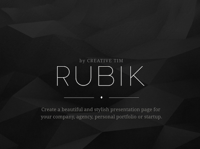
Rubik Presentation Page Review
Rubik is not just another one-page template. It is a thoughtfully designed collection of modern UI elements built on top of Twitter Bootstrap, crafted to help individuals and businesses create visually appealing, professional, and highly customizable presentation pages. In this in-depth review, we will explore what makes Rubik stand out, how it is structured, its design philosophy, customization options, and why it is a valuable tool for anyone looking to build a stylish online identity.
What Is Rubik – Bootstrap Presentation Page?
Rubik is a premium one-page Bootstrap template designed specifically for presentation purposes. Unlike generic multipurpose themes that try to do everything, Rubik focuses on one core objective: helping users create a clean, elegant, and engaging presentation page.
The template is ideal for:
- Companies and enterprises
- Creative agencies
- Startups and tech teams
- Freelancers and personal portfolios
- Designers, photographers, and developers
Built using Twitter Bootstrap, Rubik ensures responsiveness, consistency, and compatibility across all modern devices and browsers. Its structure allows users to tell their story clearly—who they are, what they do, and why they matter—without overwhelming visitors with unnecessary complexity.
Must Read : CloneDVD Review – A Deep Dive into Features, Performance, and Real-World Use
First Impressions: Design and Aesthetics
One of Rubik’s strongest qualities is its visual polish. From the moment you load one of its demos, it becomes clear that a lot of attention has been paid to spacing, typography, color balance, and component consistency.
Clean and Modern Look
Rubik embraces modern web design principles:
- Generous white space
- Clear typography hierarchy
- Balanced layouts
- Subtle animations and transitions
This makes the page feel light, professional, and easy to navigate. Nothing feels cluttered or outdated, which is crucial for presentation pages where clarity is key.
Consistent Styling Across Components
Every component—buttons, cards, navigation menus, sections, icons—feels like part of the same design language. This consistency is often missing in many templates, but Rubik maintains it exceptionally well. Whether you are using a hero section, team showcase, or testimonial block, everything looks cohesive.
Built on Bootstrap: Reliability and Flexibility
Rubik is built on Twitter Bootstrap, one of the most trusted and widely used front-end frameworks in the world. This brings several advantages:
Responsive by Default
Thanks to Bootstrap’s grid system, Rubik adapts seamlessly to different screen sizes. Whether viewed on a desktop monitor, tablet, or smartphone, the layout remains functional and visually appealing.
Must Read : Step by Step AI Video Maker tutorial
Easy Customization for Developers
Developers familiar with Bootstrap will find Rubik easy to work with. The structure follows standard Bootstrap conventions, making it simple to:
- Modify layouts
- Add or remove sections
- Adjust spacing and alignment
- Integrate additional Bootstrap components
Even users with basic HTML and CSS knowledge can confidently tweak the template to suit their needs.
Purpose-Driven Components
Rubik is not overloaded with unnecessary widgets or gimmicks. Instead, every component has been created after researching what makes an effective presentation page.
Thoughtfully Designed Sections
The template is broken into clear sections, such as:
- Hero or introduction section
- About or story section
- Services or features
- Team members
- Portfolio or case studies
- Testimonials
- Contact information
Each section serves a specific purpose and helps guide visitors through a logical narrative.
Attention to Detail
From tiny buttons to section dividers, every detail feels intentional. Hover effects are subtle but engaging, typography is readable yet stylish, and visual cues help users understand where to focus their attention.
Multiple Layout Options for Every Section
One of Rubik’s standout features is its flexibility. Instead of locking users into a single layout, the template provides multiple options for each section.
Modular Approach
You can mix and match different section styles depending on your goals. For example:
- Choose between multiple hero layouts
- Select different ways to display services or features
- Pick a team layout that best fits your brand tone
- Showcase projects in grid or carousel formats
This modular approach allows users to build a truly unique page without starting from scratch.
Tailored to Different Use Cases
Rubik recognizes that an agency presentation page looks different from a personal portfolio or startup landing page. To address this, the creators have included four complete demo examples, each tailored to a specific use case.
Must Read : WhatsApp Business Features for Small Businesses
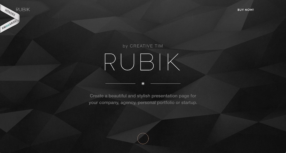
The Four Rubik Demo Examples Explained
To help users visualize how different components work together, Rubik includes four professionally designed examples. These demos are not just placeholders—they are practical, real-world inspirations.
1. Agency Demo
The agency example is perfect for creative studios, digital agencies, and consulting firms.
- Emphasizes services and expertise
- Includes team member sections
- Uses strong visuals to highlight capabilities
- Suitable for branding-focused businesses
This demo shows how Rubik can be used to create a confident and polished agency presence.
2. Company Demo
The company demo focuses on simplicity and professionalism.
- Clean layouts and minimal distractions
- Ideal for enterprises and corporate brands
- Emphasizes trust, reliability, and clarity
This example is great for businesses that want an elegant online presence without excessive flair.
3. Startup Demo
Startups often need to tell their story quickly and effectively, and the startup demo does exactly that.
- Highlights the founding team
- Showcases innovation and creativity
- Uses modern visuals to convey energy and ambition
The included music startup example demonstrates how Rubik can be adapted for tech-driven or creative ventures.
4. Portfolio Demo
The portfolio demo is tailored for individuals such as photographers, designers, and freelancers.
- Focuses on visual work
- Simple navigation
- Elegant presentation of projects
This demo proves that Rubik is just as powerful for personal branding as it is for companies.
Ease of Customization
Rubik is designed to be user-friendly, even for those who are not advanced developers.
Pre-Built Examples as a Starting Point
By downloading the Rubik bundle, users gain access to ready-made examples that can be easily customized. Instead of building a page from zero, you can:
- Replace text content
- Swap images
- Adjust colors and fonts
- Remove or add sections
This significantly reduces development time.
Customization Without Overwhelm
Unlike heavy themes with dozens of confusing options, Rubik keeps things straightforward. Its structure encourages experimentation while remaining manageable.
Performance and User Experience
A presentation page is not just about looks—it must also perform well.
Fast Loading and Optimized Layouts
Because Rubik is a one-page template and avoids unnecessary bloat, it loads quickly. This improves:
- User experience
- Engagement
- Search engine visibility
Smooth Navigation
Sections flow naturally into one another, and navigation menus are intuitive. Visitors can quickly find what they are looking for without confusion.
Ideal Use Cases for Rubik
Rubik is versatile, but it truly shines in specific scenarios:
- Startups launching a product or idea
- Agencies showcasing services and team members
- Freelancers building a professional portfolio
- Small businesses establishing an online presence
- Personal brands introducing themselves and their work
If your goal is to present information clearly and beautifully on a single page, Rubik is an excellent choice.
Strengths of Rubik Presentation Page
- Clean and modern design
- Built on reliable Bootstrap framework
- Multiple layout options for flexibility
- Professionally designed demo examples
- Easy customization
- Consistent UI components
- Ideal for presentation-focused websites
Potential Limitations
No product is perfect, and Rubik is no exception.
- It is focused on one-page layouts, so it may not suit large content-heavy websites
- Advanced customization may still require basic HTML/CSS knowledge
- It is a premium template, which may not appeal to users looking for free solutions
However, these limitations are more about scope than quality.
Final Verdict: Is Rubik Worth It?
Rubik – Bootstrap Presentation Page delivers exactly what it promises. It is a refined, stylish, and practical solution for anyone who wants to create a strong online presentation without unnecessary complexity.
Its emphasis on design consistency, flexibility, and real-world usability sets it apart from generic templates. Whether you are building a startup landing page, an agency showcase, or a personal portfolio, Rubik provides the tools and inspiration needed to make your online presence stand out.
If you value aesthetics, clarity, and ease of use, Rubik is a premium Bootstrap one-page template well worth considering.
This Rubik Presentation Page review helped me understand how to create polished, professional presentations quickly and efficiently. Following your insights, I was able to organize my content better and save hours of design work. It’s practical guidance that truly improved the quality of my presentations.
I am glad it helped you.